Feb 7
Take a peak at a fun and 60’s style playroom we designed for a client’s new home. Inspired by old Miami and the 60’s lead us to creating such a memorable space! Our client came to us wanting to do something fun in the playroom and sent some inspiration images. We knew she wanted color […]
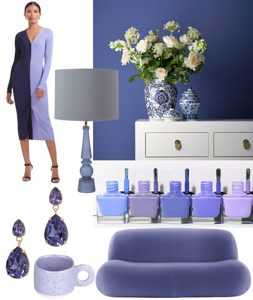
Pantone’s color of the year is Very Peri. It’s a violet blue hue that is joyous and dynamic according to Pantone. It is representative of the current times by inspiring a sense of healing and gratitude while simultaneously being hopeful about the future. This periwinkle color is calming to look at (thanks to the restful […]
Jan 12
working with an interior designer

How to chose the right paint finish

styling tips for open shelving

tips


Dec 1
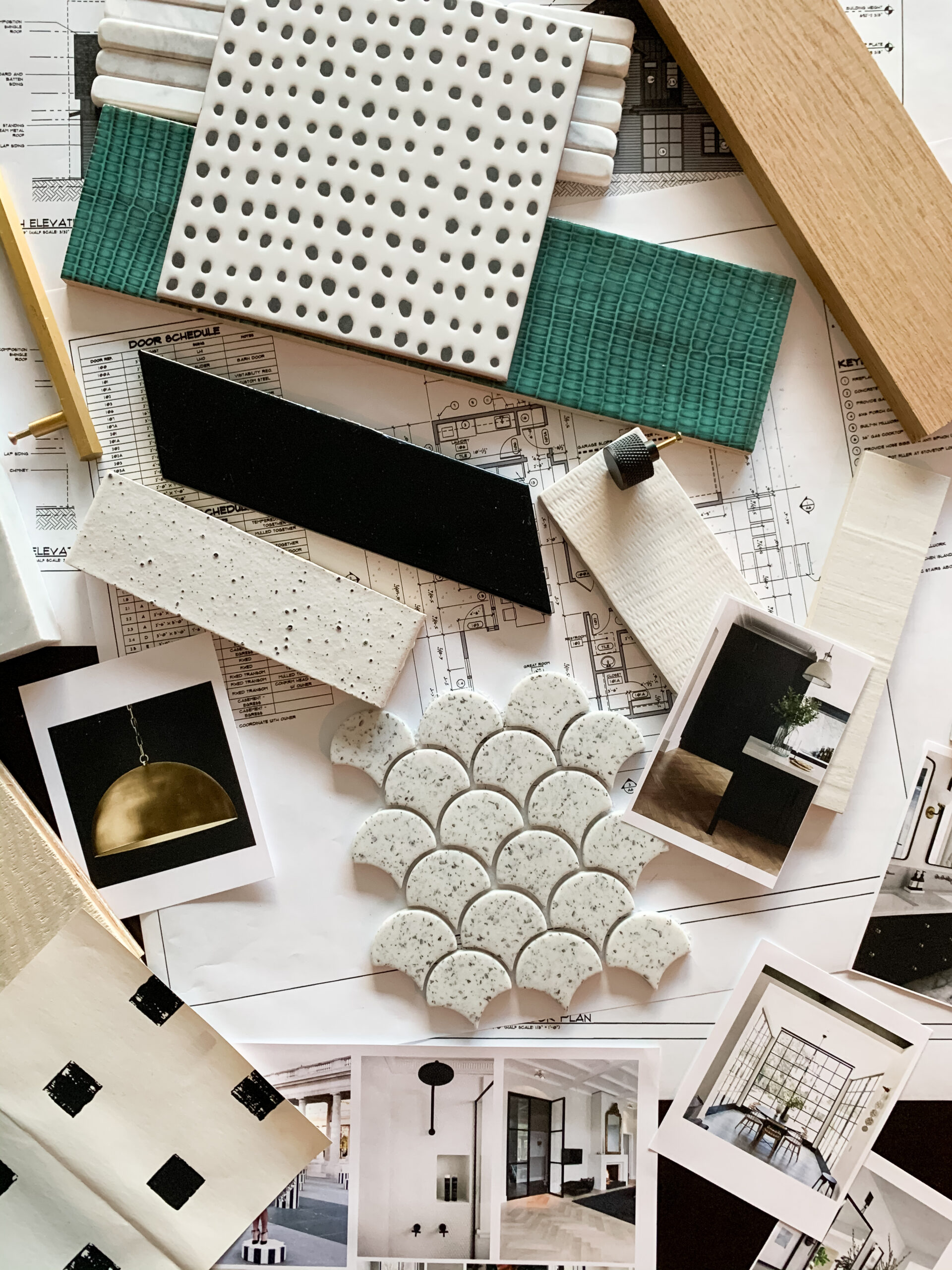
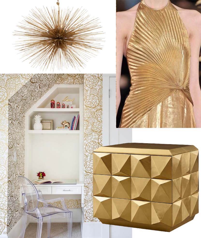
Good as Gold! Shades of brass and gold are very on trend these days. it’s by far the most requested finish from our clients. While there are some items that are more trendy, gold (brass specifically) is classic in nature. Un-lacquered brass is classic in its finish and develops a lovely patina over time as […]
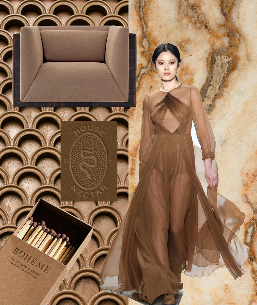
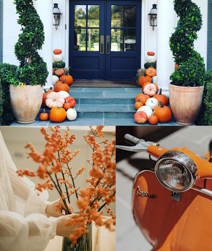
Pumpkins have inspired today’s mood board. You don’t have fall without the color orange and as we are well into fall and today is Halloween, it felt like the appropriate color for today. Orange is the color most associated with fall and therefore often referred to as a classic autumnal color. It is most apparent […]
Oct 31
Sep 7
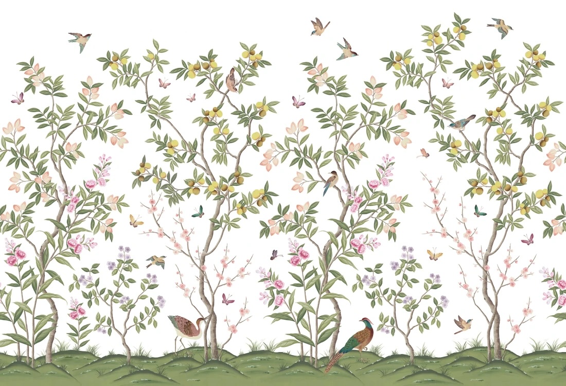
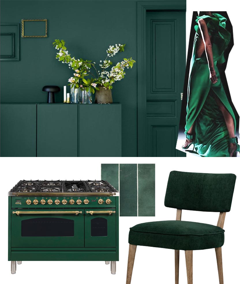
Green has definitely been having a moment! We especially love a deep green shade. One of our most liked designs is a powder bath we designed with a beautiful green tile focal wall. Green is strongly associated with nature – grass, plants, trees – so it can have a very refreshing and peaceful feeling.
