Mood: Very Peri
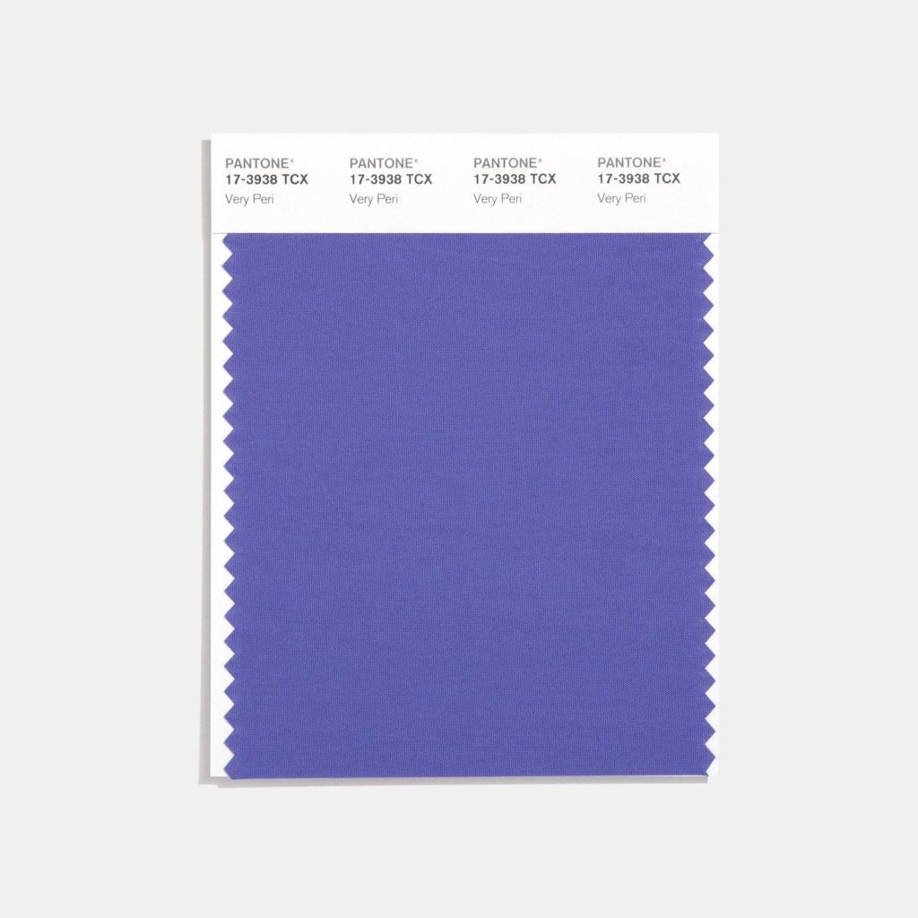
Pantone’s color of the year is Very Peri. It’s a violet blue hue that is joyous and dynamic according to Pantone. It is representative of the current times by inspiring a sense of healing and gratitude while simultaneously being hopeful about the future. This periwinkle color is calming to look at (thanks to the restful blue undertones) and is apparently motivational in nature. According to astrologers, it’s also a great way to bring positive energy into your life.
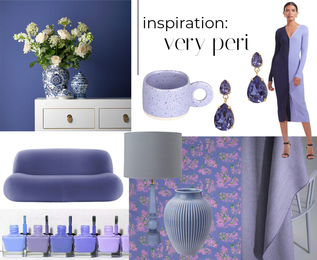
Now this color can definitely be a bolder choice when used large scale but works great as an accent color for both fashion and home. Very peri is a color that gets noticed and can pack a punch when super saturated. The good thing is that there are plenty of options (and shades) to bring this color into your world. The color was seen on several fashion runways for spring 2022 and fashion trends always make their way into the interior design space. Whether you want to wear the color or just bring it into your space, here are some ways to do just that. Here’s to a happy and abundant year to come!
Artwork from Desenio.

leave one here!
comments