Feb 19
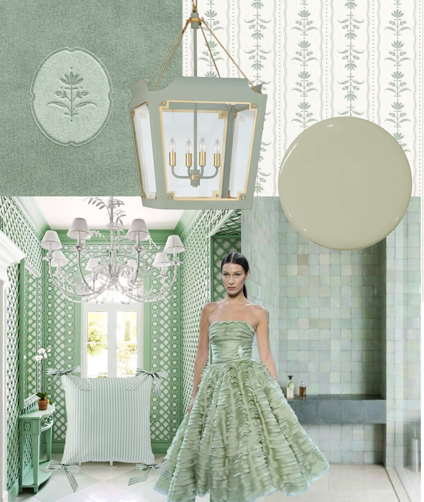
Valentine’s Day was last week and we did a mood board on the blushing shade of pink. What is one color that pairs beautifully with pink? Sage! A soft, romantic pink is gorgeous when paired with this chic shade. Sage recalls nature; it is an earthy greenish gray color that immediately calls to mind nature, […]
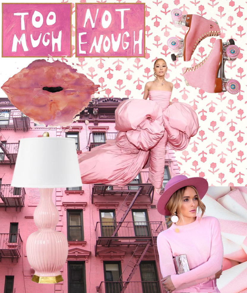
With Valentine’s Day this week, it’s only appropriate that our Moods board for this week is all about the blushing color pink! The color pink can range from soft and romantic to bold and dramatic. Pink symbolizes love, nurturing and things going well in a positive and healthy way. Phrases like “tickled pink” or “everything […]
Feb 11
working with an interior designer
How to chose the right paint finish
styling tips for open shelving
tips
Feb 5
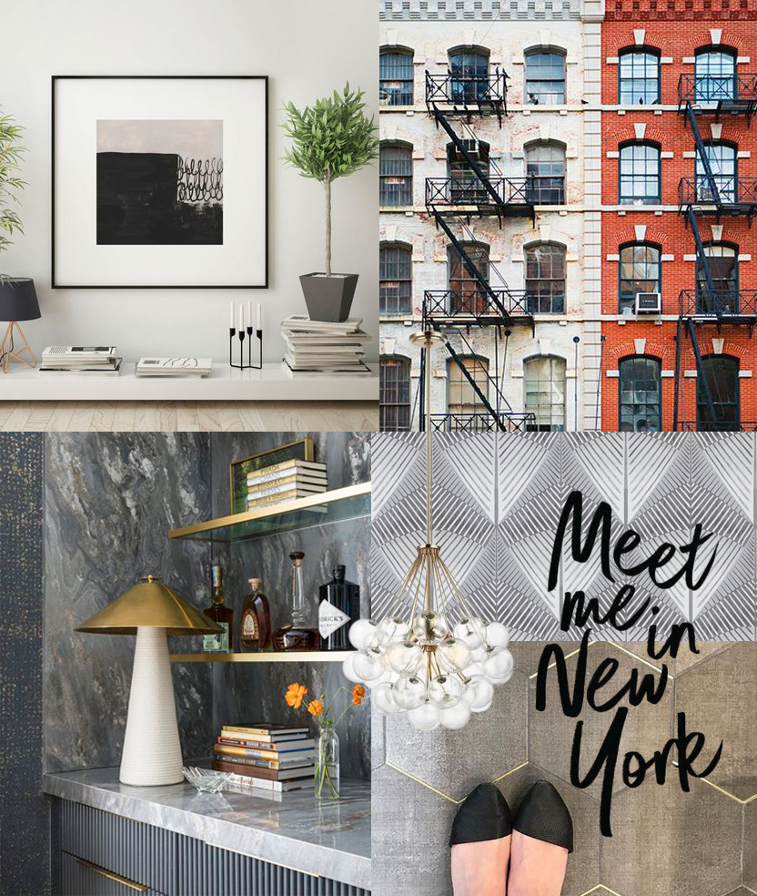
We are taking a peek behind the curtain at the overall concept (and various concept boards) developed for our New York clients who moved to Austin. Their existing home has beautiful views of Austin, Texas but the house was dated, very traditional home and in desperate need of a facelift. The existing style of the […]
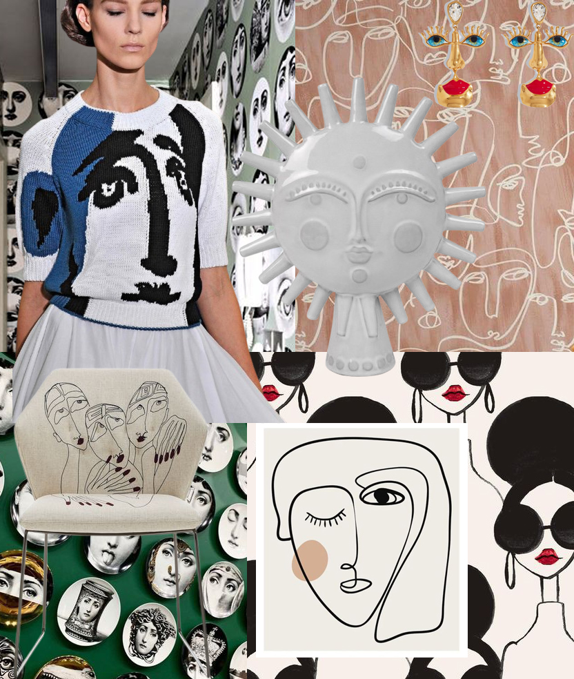
Putting a Face to Style: Bold & Chic Ways to Use Faces in Design Let’s face it. Faces are all the rage! They are a fun, whimsical and playful element in fashion and design. Creatives have been using this motif for quite some time and we love that this classic yet modern trend continues! What […]
Feb 3
Jan 27
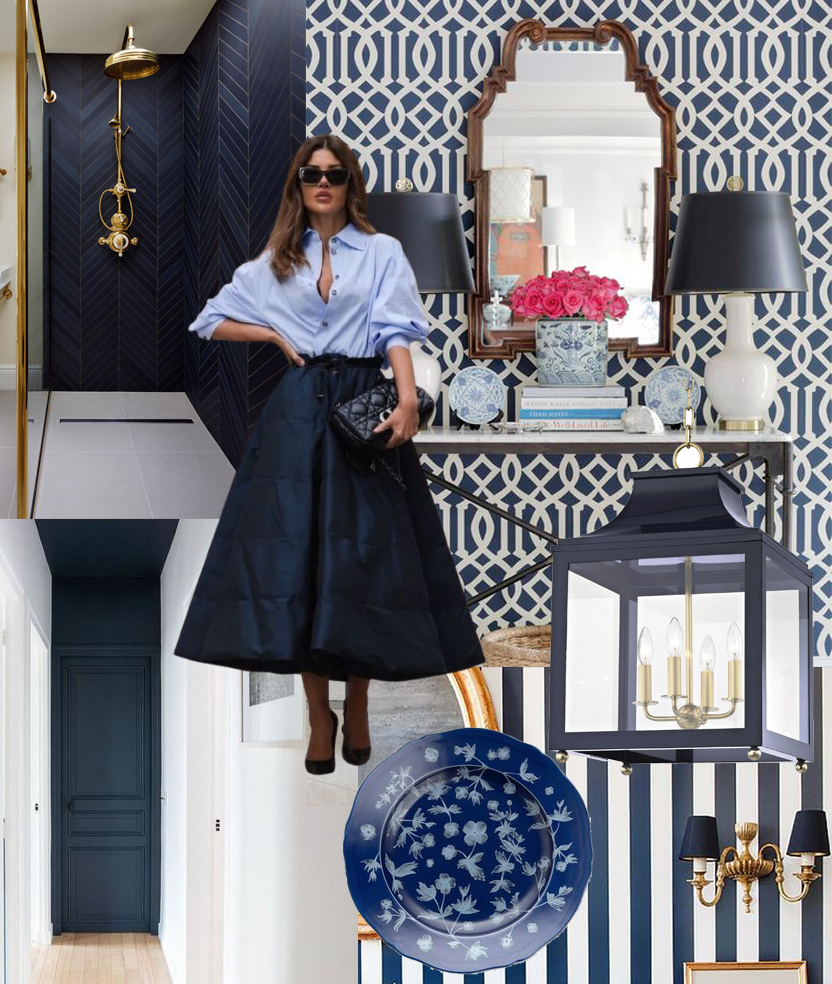
Into the Deep: Why Navy is the New Neutral Navy is a classic color! We have such affinity for this color that we selected to be our logo color. To us, navy is the ultimate sophisticated statement. The color itself dates back to the British Royal Navy where this dark shade of blue was used […]
One of my favorite rooms to design is a nursery! They are so sweet, full of excitement and personality and there are so many cute products these days. We love that more and more clients are requesting nursery designs! Designing these rooms at such a joyous time of life is also quite lovely. While babies […]
Jan 22
Jan 21
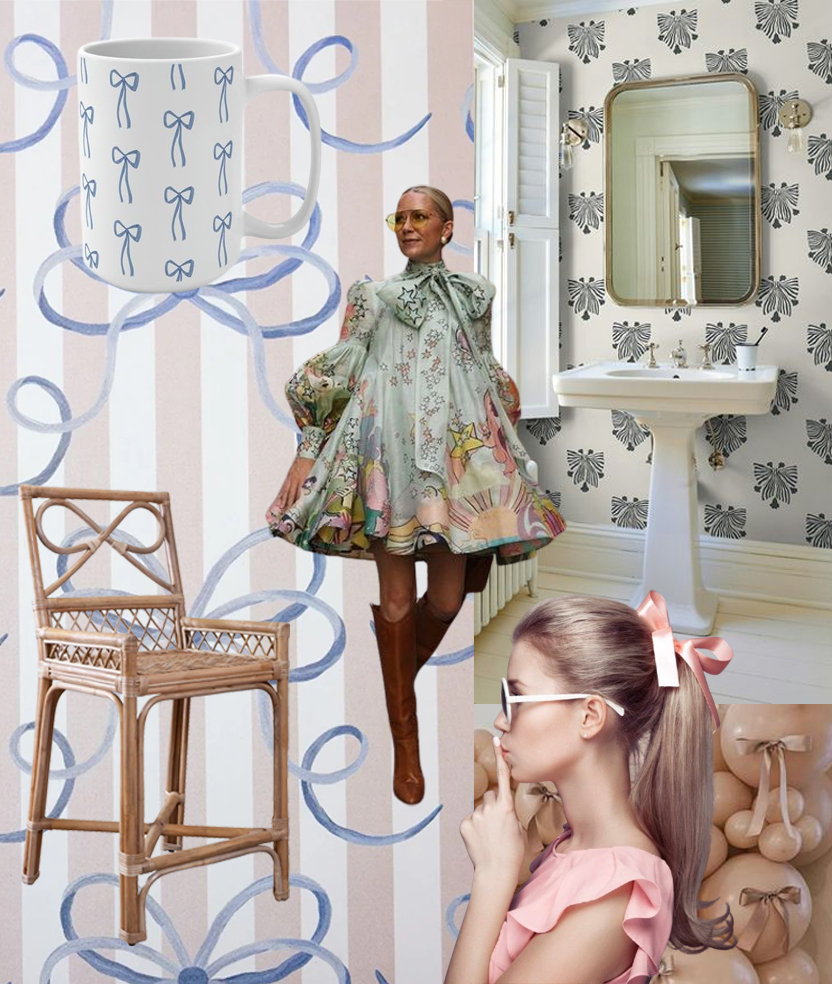
The art of the bow Bows have been everywhere in both the fashion world and home decor these past few seasons. They are fun, feminine and flirty easily lending themselves as a cute fashion accessory or home embellishment. Bows have been around for centuries and they initially served more of a utilitarian purpose-they literally tied […]
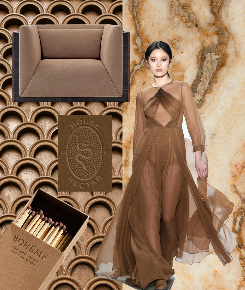
The 2025 Pantone color of the year is a warm, rich, and sophisticated hue. It is Mocha Mousse 🤎! What do we love about this color choice? We love that it is a great neutral tone that offers versatility in many design schemes. While color trends have been swinging warmer as of late, (we love […]
Jan 14
Feb 14
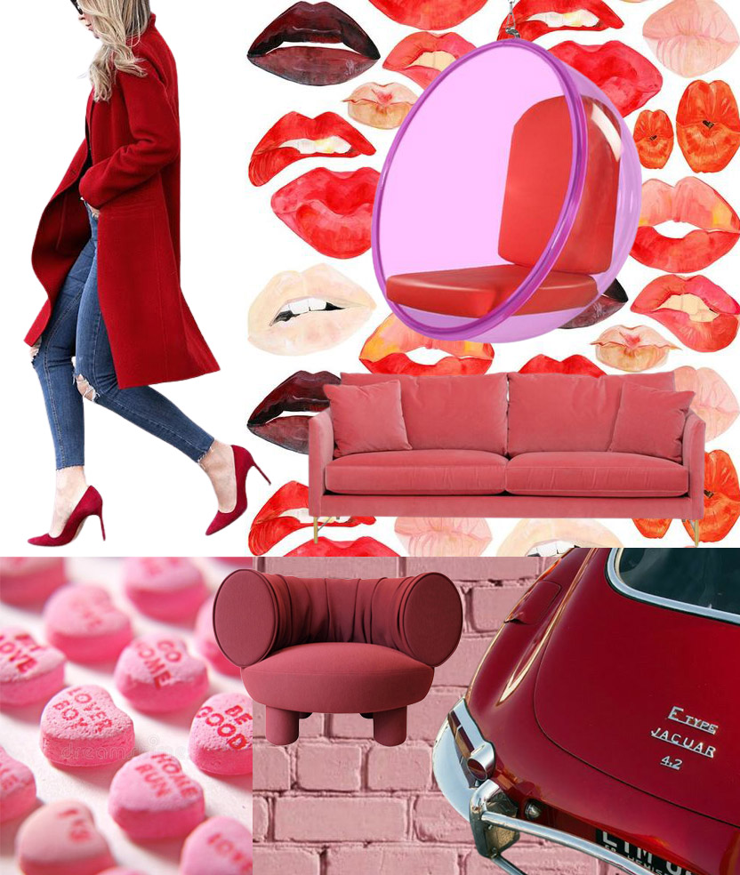
At first blush: a romance with pink and red. In honor of Valentine’s day, we are having fun diving into deeps reds with pops of pink! Pink and red are such a fun color combo and it does not have to be Valentine’s day to pull it off. From fashion to interior seating to wallpaper, […]
