Project: Studio Remodel – Pilates. Physical Therapy. Wellness
We just wrapped up a fun commercial project with a fabulous client. Here’s how her physical therapy studio came to life.
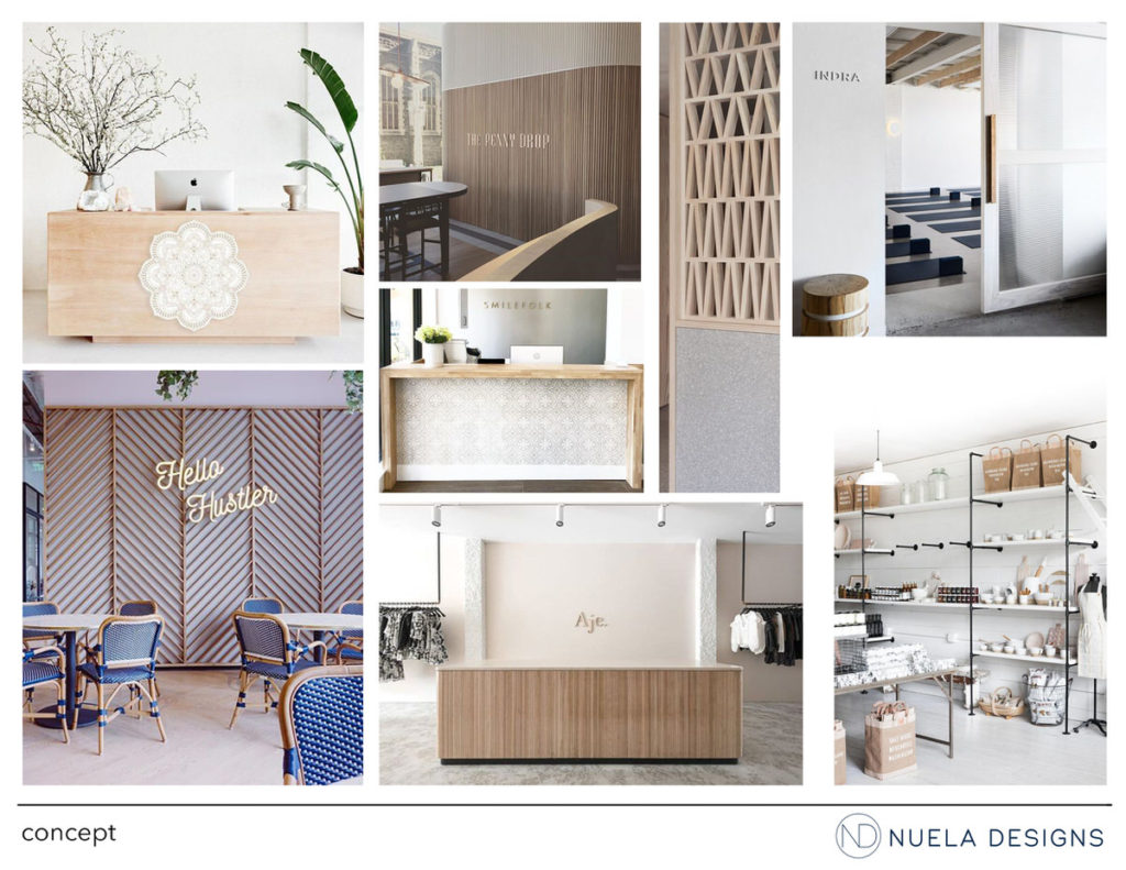
Concept
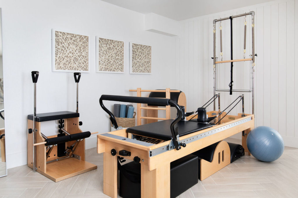
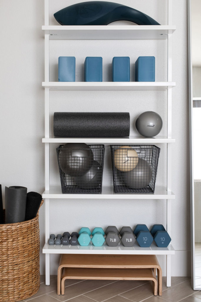
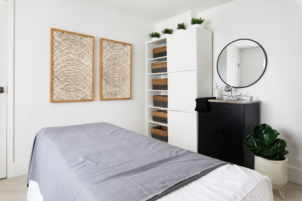
The goal was to create a space that was welcoming, warm and fresh for our client’s studio space. We had the overall concept defined for a while – it was just a matter of time finding the right space to realize her vision. We knew that she needed two rooms minimum so that she had a private space for her wellness room and an open space for the rest of the pilates and yoga equipment. She also needed storage for all of the smaller equipment that she needs regular access to. We pulled images that were white and bright as well as warm with light wood tones.
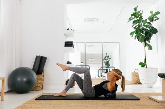
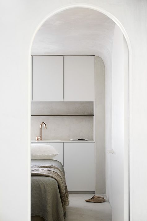
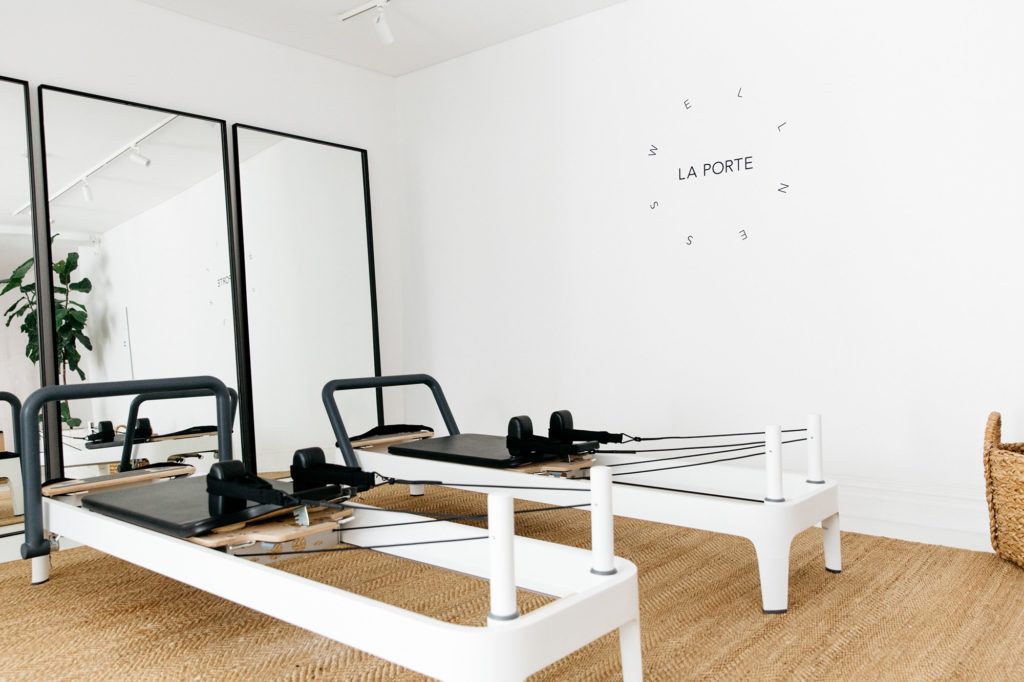
Inspiration images via Pinterest.
The Space
Once our client found a location, we knew the space was going to need a lot of love. The before aesthetic: dark, worn and just plain gross.
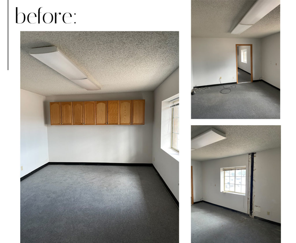
We completely gutted the space and got rid of all of the old materials: cabinets, light fixtures, carpet, baseboard. We scraped the popcorn ceiling to a flat smooth finish and brought in new materials throughout to make this space feel inviting for our client’s clients. We did demo the existing wall and built a new wall to accommodate a wellness space.
The Design
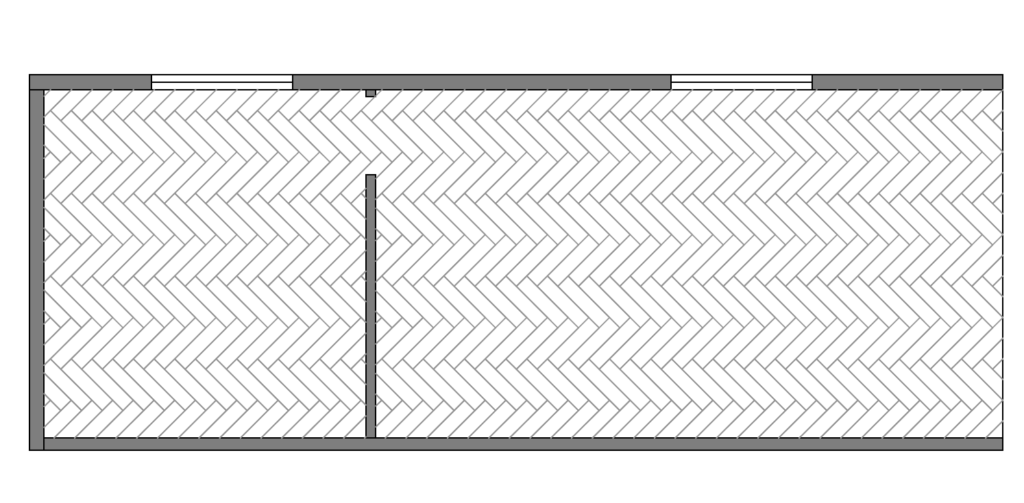
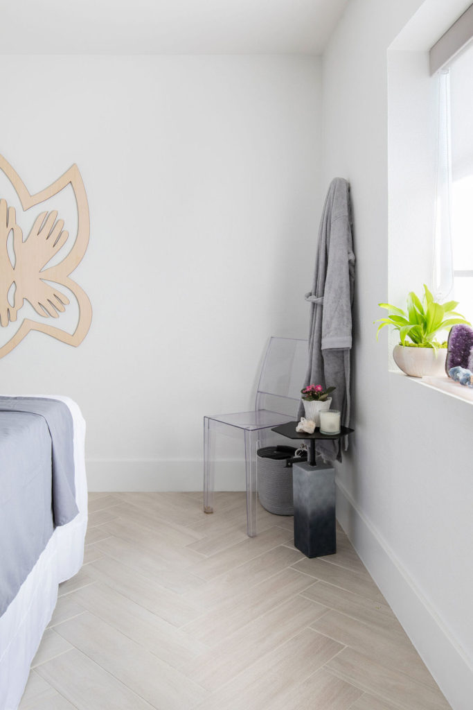
For the flooring, we selected a tile the was neutral and light in color. The tile resembled wood which made the space feel more warm but was going to be easy to clean. We opted to lay it in a herringbone pattern to make the space feel more interesting.

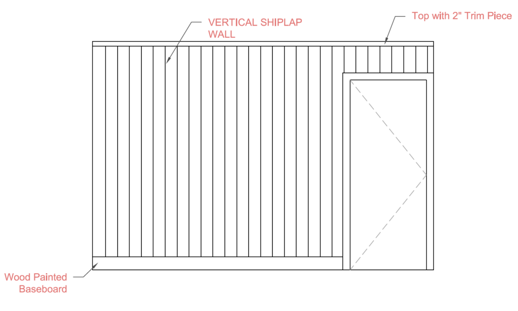
We also added texture to one of the focal walls by paneling it floor to ceiling. Adding paneling to any wall is a simple way to elevate the look and feel of a space.
The Completed Space
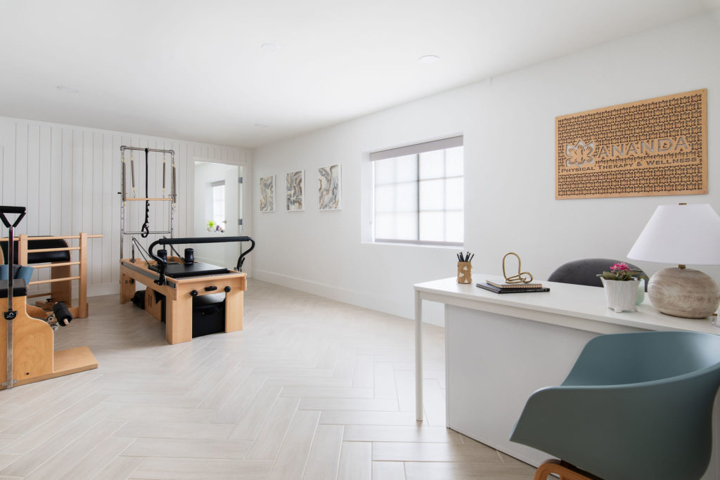
We are so happy with the transformation of this remodeled space. It went from a drab box to a warm and bright space ready for our client to start welcoming her clients into her new studio. We painted all of the walls and ceiling a soft white color, which added to the brightness of the space. We added light gray roller shades to add a little bit of color and allows for privacy when needed.
leave one here!
comments